>
Category Archives: art
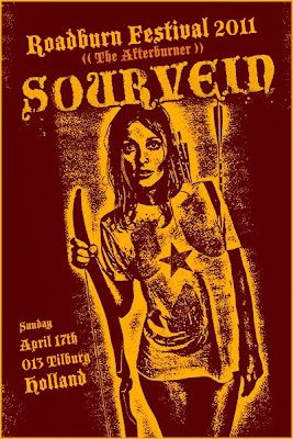
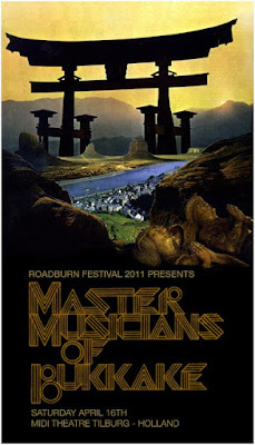
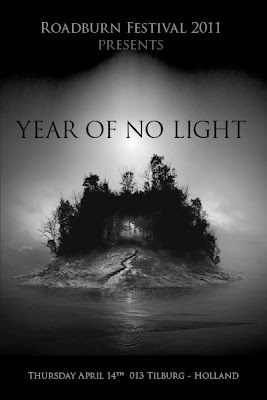
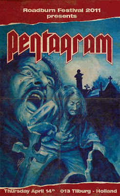
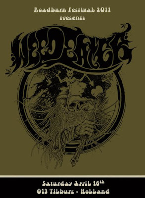
>Roadburn 2011
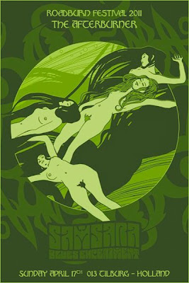
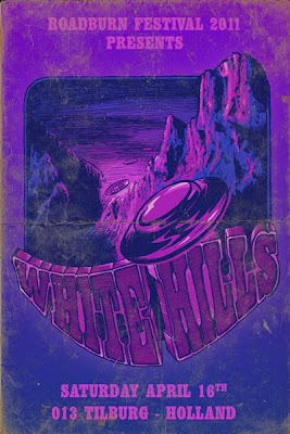
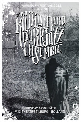
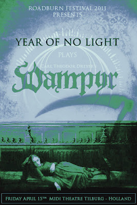
>The festival of all festivals – Roadburn – is only a few days away!
Until then, rest your eyes on some mighty fine art and worship the manifesto:
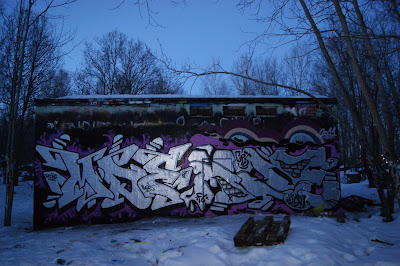
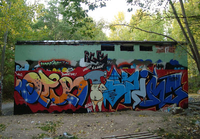
>One Wall – A collaboration with STHLMGRAFF
>
>Scalped
>
The American Indian reservations are the last chance for the survival of ancient traditions and ways of life. Yet the states drive Indians off their land (most of the Western Shoshoni people’s land, for example, was long ago confiscated for underground nuclear testing), claiming they can offer them a better life in the cities. However, the Indians will enter an American society where they will be cultureless people, bereft of just about everything.
The American Indians are forced to face a very old dilemma.
At the dawn of the fifteenth century, Spanish conquistadors and priests presented the Indians they encountered with a choice: either give up your religion, culture, land and independence, and swear allegiance to the Catholic Church, or suffer all the damage that the European invaders choose to inflict upon you.
To the conquering Spanish, the Indians were defined as natural slaves. Subhumans. That’s how they wanted to use them. The British and the Americans had little use for the Indians as slaves, so to justify their particular genocide they appealed to Christian sources of wisdom: the Indians were Satan’s helpers, they were murderous wild men of the forest, they were bears, wolves and vermin. They were beyond civil life. Hence, straightforward mass killing of the Indians was the only thing to do. They needed the land, not the humans.
Today is no different. The choice still stands: Surrender all hope of continued cultural integrity and effectively cease to exist as autonomous people and prepare yourself for even worse merciless inequality in our cities, or remain on the reservation and attempt to preserve your culture admist the wreckage of governmentally imposed poverty, hunger, ill health and the endless attempts of the state trying to rob you of your land.
The poverty rate on American Indian reservations in the United States is almost four times the national average. In Pine Ridge in South Dakota (where more than 60 percent of homes are without adequate plumbing, compared with barely 2 percent for the rest of the country) the poverty rate is nearly five times greater. The conditions on many reservations are no different from conditions that rule throughout the Third World.
The suicide rate for young Indian males and females aged 15 to 24 years is around 200 percent above the overall national rate for the same age group, while the rate for death caused by alcohol – another form of suicide – is more than 900 percent higher than the national figure!
American Holocaust.
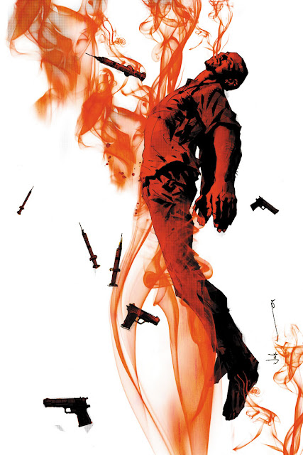
This is the setting for Scalped, a grim graphic novel created by Jason Aaron and R.M. Guéra. As described on the back of the first volume, Indian Country: ”…a gripping mix of Sopranos-style organized-crime drama and current Native American culture”.
So, life and crime on ”The Rez”, then.
Dashiell Bad Horse ran away from poverty and despair on the Prairie Rose Indian Reservation (could very well be the above mentioned Pine Ridge) some fifteen years ago, and now he’s back, only to find that nothing has changed, except for ”the glimmering new casino and a once-proud people overcome by drugs and organized crime”. It is the eve of the opening of the casino. Welcome to violence.
It turns out that Dash is an undercover FBI agent, and he ends up infiltrating this web of criminality spun by tribal leader Lincoln Red Crow, a former ”Red Power” activist now turned crime boss and the most hated man on the rez, who before he ventured into the heart of darkness was the compatriate of Dash’s mother, Gina. How’s that for a complex and totally unruly sentence? Well, that’s how I felt about this multi-layered, uncomfortable and deeply gritty story in the first place. Unruly. At times I found it hard figuring out who was who, kind of like when I read Blood Meridian the first time. But it was worth the effort of hanging on.
Scalped has its fair share of people holding on to their many secrets, almost Twin Peaks-like, and as the back story is slowly being revealed I was deeply impressed. This is so much more than fights, trashy sex, Indian pride, split families, domestic abuse, mindless violence, scalpings, shootings, revenge, drugs, prostitution, racism, lies, sorrows, drinking and gambling. Much more. The hero and the villain are as crappy and dirty as the world they live in. Here is no peace. Only the lust for vengeance, flesh, profanity and power.
I cannot agree with the Sopranos comparison, though. Aaaron has stated he had The Wire in mind when creating Scalped, and that’s more like it. Like a mixture of Oz and The Wire, maybe. Deadwood? I haven’t even seen that series yet, so throw in some Frozen River and Gomorrah, and that should do it for most of you.
>Life – A continuing story of survival horror
>
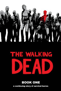
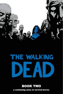
The Walking Dead by Robert Kirkman is that famous graphic novel currently being adapted for the screen as a TV series produced by the same channel that gave us Mad Men and Breaking Bad. It’s directed by Frank Darabont (The Shawshank Redemption, The Green Mile), so I’m definitely psyched. The first shots look very promising.
But at first, I wasn’t that impressed with the novel. It isn’t original at all; it’s that same old story of one dude waking up all alone in a hospital creeping with zombies, finding his way to a camp of survivors, etc, etc… Very standard. And man, I never thought I’d enjoy a soap opera! Because that’s exactly what it is.
Kirkman states how he loves zombie movies, but hates their open endings. He always wanted to know where the characters went next, after the credits roll. That’s why – at this point, at least – the series is ongoing, pretty much stumbling on without an end. You might think it’ll get boring and repetitive, but having read the first four volumes (issue #1–48) I’m pretty impressed with the way things are going. In short, you’re up for a pretty dazzling post-apocalyptic zombie ritual soap opera.
Essentially, it all boils down to our basic human needs; breathing, eating, sleeping, fucking, exploiting, creating and destroying. It’s about our primal instincts and the reducing of humanity (yes, even among those that are alive – The walking dead are the survivors, in this sense). As the story unfolds and we get to know the characters, we’re in for some hefty relationship drama. And this is were the focus lies; on the ongoing building and shattering of relationships in times of hardship. This is about the people, not the monsters.
As this is pretty far from deep and rather filled to the brim with the most obvious cliches, I still like it. If I wanted deeper stuff, I’d probably go for Y – The Last Man instead. This is Zombie Lit, and with that you also get the old fashioned sexist idiocy (which seems to be the very essence of the Lit genre…). Compared to the complexity of Watchmen, for example, this reads more like Tom and Jerry. But as long as you know what to expect, I think it’s ok.
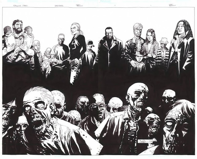
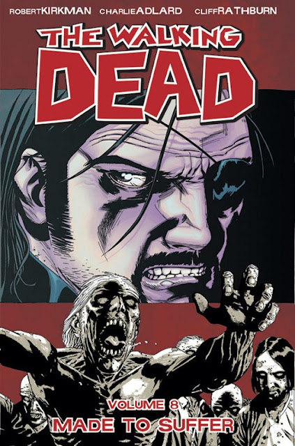
As for the art, we get some truly powerful, beautifully detailed illustrations of the most vicious gore. However, the art is far from consistent, which is a bit annoying. At times, it’s just splendid, like the larger panorama-like strips. But every now and then, I get the feeling the artist has been in a hurry. Also, there’s an artist change after the first six issues which makes it even more irritating. However, once you get past this moment of vexation, it’s pretty well executed. I’d like more of the details, though, like Glenn wearing Swollen Members- and Hieroglyphics shirts. Tony Moore, who did the first six issues and the cover art up until issue #24, is more into details, while Charlie Adlard, Moore’s successor, works in a more simplistic way. I like them both, though, even though I’d love to have every single strip as detailed as the cover below:
Yes, there’s a huge difference between Moore and Adlard, but as the series went on I kind of got to like Adlard’s stuff more and more. I find Adlard’s art to be a lot darker and straight to the point, even though Moore pays more attention to details. Dark is good.
>Dreaming in red – The art of Alex Varanese / Chong Weikk
>blu – BIG BAG BIG BOOM
>When graffiti is not enough…
BIG BAG BIG BOOM – the new wall-painted animation by BLU from blu on Vimeo.


